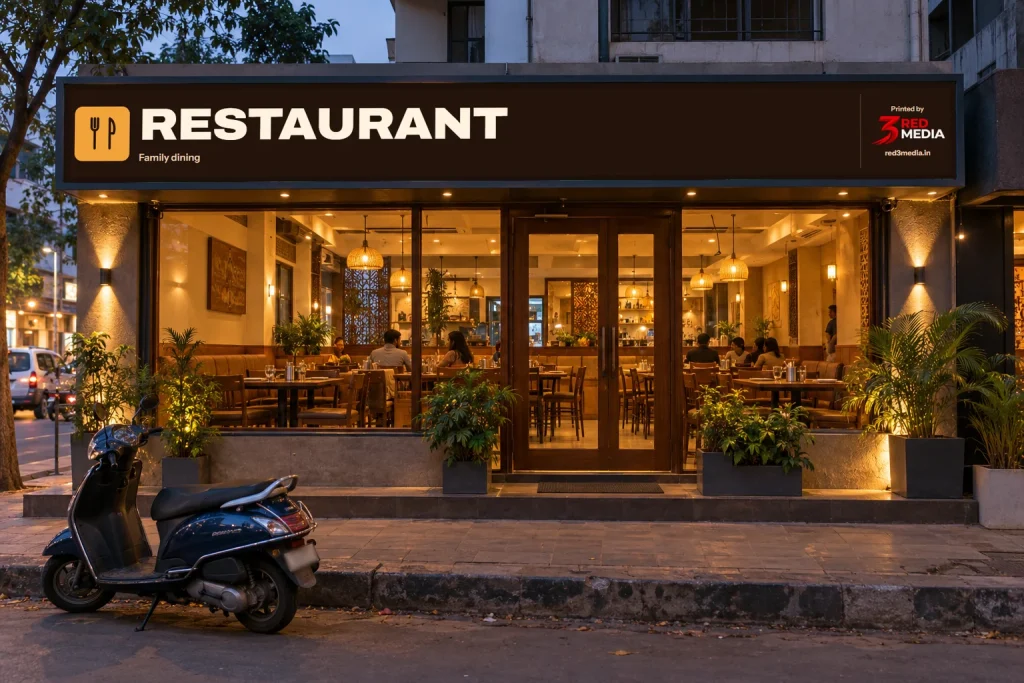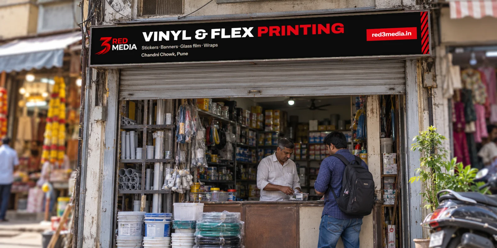
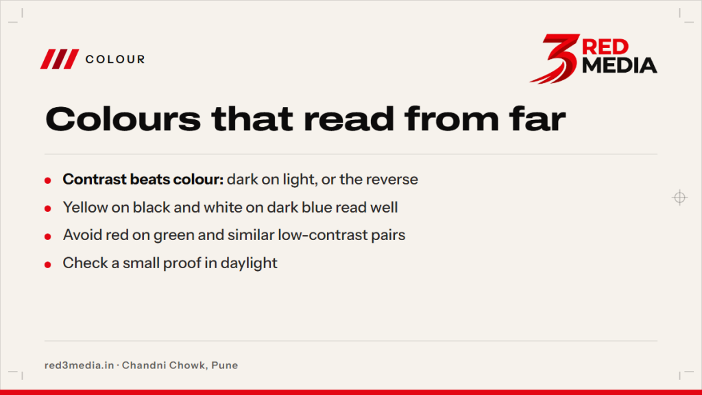
The best colour for signage is the colour combination people can read quickly from the distance they see your sign. Start with strong contrast between the letters and background, then check the design in daylight and at its actual viewing size.
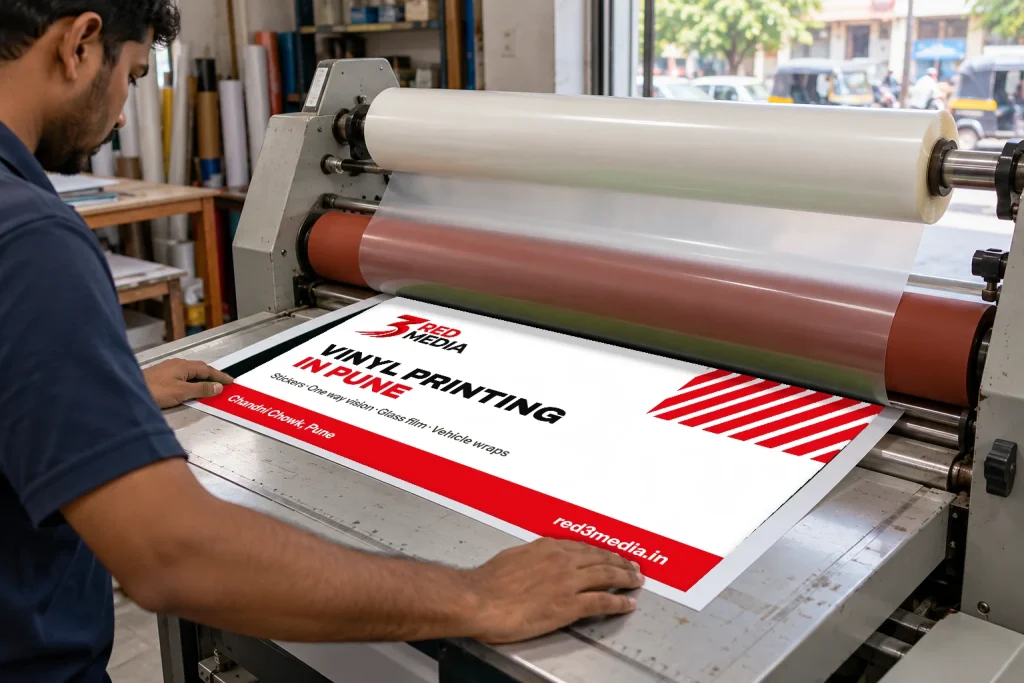
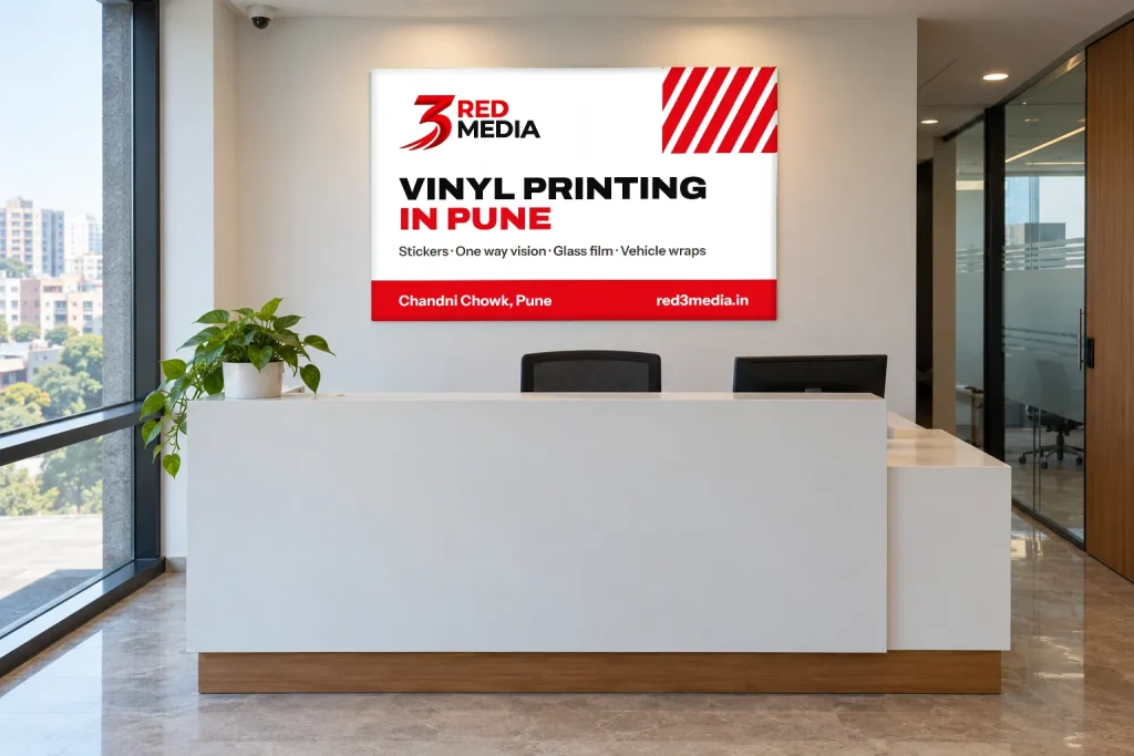
For a shop board, dark lettering on a light background or light lettering on a dark background is a reliable starting point. At 3 Red Media in Chandni Chowk, we print vinyl for signs and share a digital proof for approval before printing.
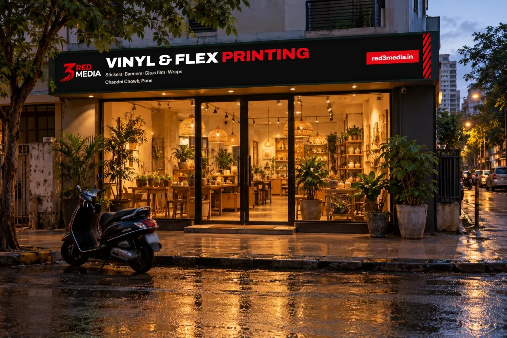
What is the best colour for signage?
There is no single colour that works best for every sign. The background, letter colour, font weight, viewing distance and available light all affect legibility. A colour that looks clear on a phone can be difficult to read on a large board across a busy road.
Think first about the main message: a shop name, service, direction or offer. Give that text enough contrast and visual space. Supporting details can use a secondary colour, but they should not compete with the most important words.
As a starting point, try black or deep blue on white, or white on dark blue. Yellow on black can also stand out, especially for short words and simple symbols. These are starting combinations, not a guarantee: the size and weight of the lettering still matter.
If you need a sign board for a storefront, see sign board printing in Pune. The right material and format depend on where the board will sit and how people will view it.
Which colour combinations are easiest to read?
A strong difference in lightness between the background and the text helps the letters stand out. Compare the colours in greyscale, too. If the two shades look nearly the same when viewed without colour, the text may not separate clearly from its background.
| Combination | Where it can work | What to check |
|---|---|---|
| Black on white | Names, directions and detailed text | Use a font weight that holds up at the viewing distance. |
| White on dark blue | Shop names and short messages | Keep the background dark enough to separate from the letters. |
| Yellow on black | Short headings and high-attention messages | Avoid thin lettering and long blocks of small text. |
| Dark green on pale cream | Brand-led signs and simple information | Check that the shades remain distinct in the actual light. |
| Red on green | Usually difficult to distinguish quickly | Choose a different background or text colour. |
Colour names alone do not tell you how readable a pair will be. A pale blue background and light grey text can both be attractive, but their similar brightness makes the text harder to pick out. Make the text lighter or darker, or change the background.
For a board seen from across a road, choose larger, simpler lettering and a clear background. Small details, thin strokes and several competing colours take longer to read. If customers will view the sign up close, you have more room for supporting information.
Which colours work best on a shop board in sunlight?
For an outdoor shop board, check the colours in the light that falls on the sign. A board in direct sun can look different from one under a verandah or inside a shaded arcade. West-facing glass and boards can get harsh afternoon sun in Pune, so check the contrast at that time if that is when the surface receives direct light.
Also consider the direction from which customers approach. They may see a fascia from across a road, from a moving vehicle or while walking along the footpath. Use a short main name, bold enough lettering and enough open space around the text. Avoid placing a key message over a busy photograph or detailed pattern.
Rain and wind during Pune’s monsoon, roughly June to September, can affect where and how a sign is mounted. Outdoor printed vinyl is usually laminated, but the right setup depends on the sign and its exposure. Share the size and where it will be installed so the material and any required fitting can be considered.
A printed vinyl design mounted on sunboard can suit an indoor or covered sign. For information about printed board options, see our sign board printing page.
What colours should I avoid together on signs?
Avoid combinations where text and background have similar brightness or sit too close in colour. Red on green is one common example: the colours can be hard to separate quickly, especially for some viewers. Pale yellow on white and light grey on silver-looking backgrounds can also lose definition.
Bright colours can be useful for a short highlight, but too many bright shades compete for attention. Set a clear order: the sign name first, the service or offer next, and the smaller details last. Reserve the strongest contrast for the words people need to notice first.
Patterns, shadows and gradients can reduce clarity behind lettering. If you want to use them, leave a clean area behind the key text or add a solid panel. Keep fine details away from the edges where they may be less noticeable at a glance.
If you are matching a storefront across a fascia, door and other printed items, see shop branding printing. A consistent colour palette can help customers recognise the business, while clear contrast keeps each sign readable.
How do I choose colours for night visibility on a glow board?
First check how the board is lit and how far away people will be when they see it. For any internally lit or illuminated sign, a digital mock-up may not show exactly how colours will appear after lighting. Ask whoever is arranging the board or illumination to confirm how the chosen materials will look in that setup.
Keep the main words short and make the text and background visibly different. Very bright backgrounds can make light letters harder to distinguish, while small lettering may be difficult to read in dim conditions. Check the design in the lighting and viewing conditions where the sign is meant to be used.
An illuminated sign may involve electrical work or fabrication as well as printing. We print vinyl for the sign; when you send the size and details, ask us whether the other work can be arranged for your job. For a printed flex option used with backlighting, see backlit flex printing in Pune.
How do brand colours fit with readable signage?
Use brand colours where they support recognition, then check whether the name and main message still stand out. If two brand colours are too similar in brightness, use one for the background and a neutral or darker shade for the lettering. A narrow accent line or small highlighted word can carry a brand colour without making the full sign difficult to read.
Think about what the sign needs to do. A logo can have detailed colours, while the shop name beside it may need a simpler treatment. If the artwork has several logos, patterns or service names, decide which one people should notice first and give it the strongest contrast.
How do colours print differently on vinyl?
Colours on a screen are made with light; printed colours are made with ink on a material. As a result, a colour viewed on a phone or laptop can look different on printed vinyl. Screens can also be set to different brightness and colour settings, so a digital preview is useful for layout approval but cannot always show the final colour exactly.
Check that the artwork uses the intended colour values and that the design has enough contrast after it is placed on the sign background. For important brand shades, ask for a printed sample or colour check before committing to the full job. View it in daylight and at a useful distance.
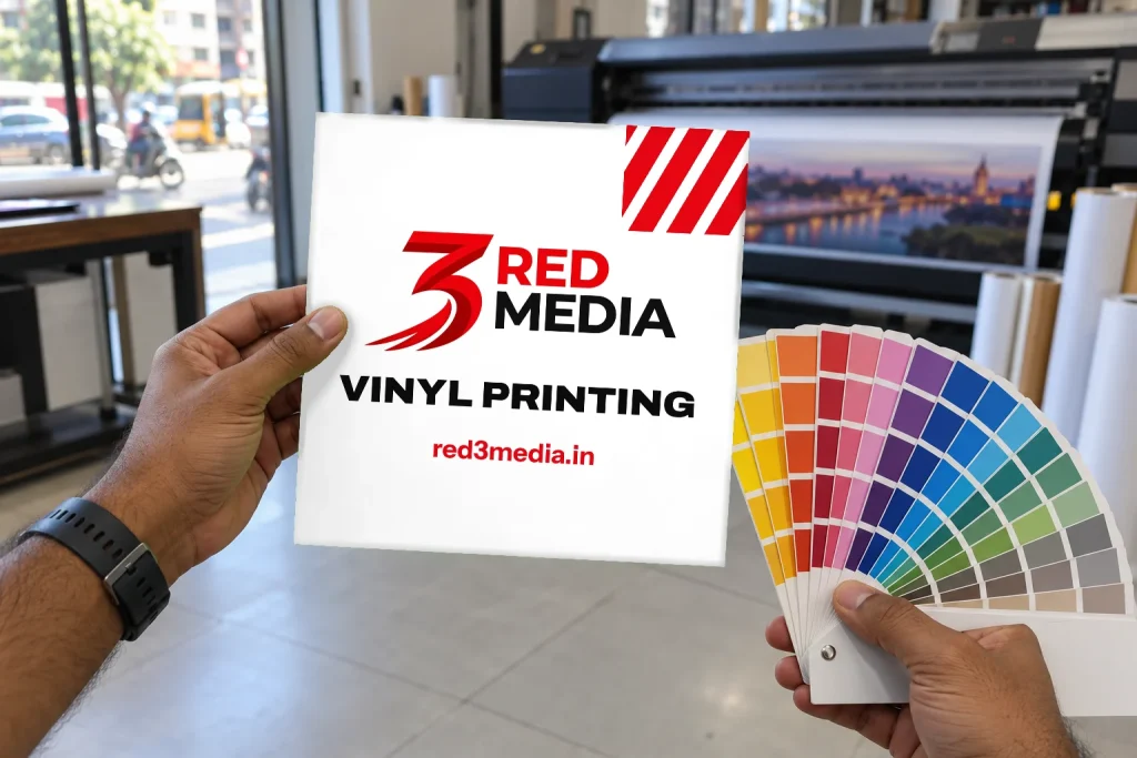
Send the size, intended use and design files with any notes about colours that need to match. Our artwork guide explains what to prepare. We share a digital proof, and printing begins after you approve it.
If your shop name or other text needs to appear in Marathi, check the current requirements with your ward office. Requirements can depend on the applicable rules and your location, so confirm the details with the relevant authority before the board is made.
To get a quote, send the sign size, design and where it will be used through our quote form. We can review the artwork, prepare a price and share a digital proof for approval before printing.